Charity Engine started long before Charity Engine started. In other words; researching how to create it, partnering with the charities, legal work and due diligence took the best part of two years before the website even existed.
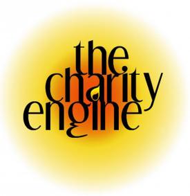
All that had to be in place before we could find investment, hire technical co-founders and start actually designing and building it. But Charity Engine obviously needed a web-presence during that time, so we put up a simple landing page with what can only be described as a 'home-made' logo:
In our defence, those free logo-making websites are not exactly feature-rich. But we have no excuse for choosing the same warm and friendly colour scheme as a bag of wasps. The only reason for yellow was it made the space in the letter 'a' look like a candle flame, which we thought quite appropriate as a 'light in the darkness' metaphor – although it only worked with inappropriately Olde Worlde fonts.
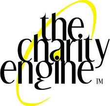
The first web agency we approached refined the logo – well, sort of. What they really did was allow a complete amateur designer – their customer – tell them how to refine it. Which was not a good idea, unless you're a big fan of Lord of the Rings. For a short time, this was our second logo:
Well, at least it was warm. Thankfully, when our co-founders took over the job, the lead designer put it in simple terms: either the logo went or he did. A modern website demanded modern design, and this was not negotiable. But he did choose to remember the old logos in the redesign, which is why the Charity Engine logo still has a flame today - and no longer looks like a bad tattoo...!